Back Story:
I wanted to grow and gain confidence as a UX designer quickly. So I challenged myself to mini-design exercises, such as redesign of existing websites.
Shopee Web 2.0

Scope of project: Shopee's Home Page
Goals:
1. Primary (User) — Optimise the shoppers' experience with improved site navigation and layout
2. Secondary (User/Business) — Increase customer confidence in the shopping platform
Deliverables: Prototype of Home Page
Success Metrics:
1. Number of customer conversions
2. % of customer who would recommend Shopee to their friends.
Background
I love shopping on Shopee for the wide variety of goods offered on its website. However, the sheer number of products on the landing page tend to leave me with an information overload and decision paralysis, which delayed my eventual purchase.
While I understand the current interface design might be intended to get users to spend longer time browsing the site, I felt the shopping experience could be refined.
TLDR: I wanted a more efficient shopping experience.
Problem Statement
Shoppers struggle to find the product they are looking for on Shopee's website because of the multitude of products available.
My solution aims to improve the main site navigation and layout to make it easier to search and browse for their desired items upon arriving at the home page, and increase their confidence in shopping with Shopee.
General Overview of Design
-
A top navigation bar to improve user navigation
Adopted the well-established convention and provide the highest-level means of navigation in one position across all different sections of the user interface.
2. Single row feature of product to reduce decision paralysis
Limited the number of products (max 7 products) featured on home page to one row for each 'genre' of products.
3. Social proof to increase customer confidence
Added a section of positive customer reviews to influence customers and promote products and the shopping platform
4. Cover flow to improve visibility of main ads
The cover flow reveal snippets of other ads in the collection. Non-static ad should be used reasonably to avoid overwhelming the users.

4
{
3
1
1
2
1. Top-level navigation bar
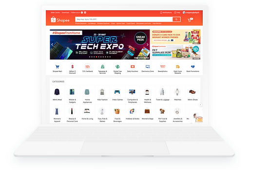
The existing shopee site features categories as icon links. While this may entice leisure shoppers who are just browsing to click, I wanted a more concise and systematic layout that would better cater to product-focused shoppers.
-
Adopted a top-level navigation bar
It serves as a website’s central nervous system and provides ease of site navigation across all web pages.
Orginal Shopee Website

-
Grouped categories based on their attributes into sub-categories accordingly
I also standardised the terminology used, for instance, ‘Women's Apparel’ and ‘Men's Apparel’, instead of the current term ‘Men’s Wear’. The order which the categories are presented can be adjusted based on consumer data.
Proposed Global Navigation Bar
2. Single row feature of products

The existing shopee site features many ongoing promotions — Flash Sale, Shopee Mall, 'Daily Discover' — all constantly vying for your attention and makes the web page lengthy.
The image-heavy website affects the loading speed of the site too, which may cause shoppers micro-frustrations and affect their shopping experience.
Less is more. It is the paradox of choice: Too much choice is stressful.
Sample of Shopee's 'Daily Discover' listing on home page
-
Reduce the number of products featured
Using Miller’s theory on information processing, between 5 - 9 items presented at one go is optimal for users to cope. By using a masonry layout with varying sizes of the products featured, this allows the brain to process the information better.
Daily Discover: Instead of having the original 48 products featured, I narrowed it down to one row of 6.
Shopee Mall: Presented brand promotions in one row instead of two rows to reduce the length of the web page.
-
Repositioned promotions
I increased the visibility of the EuropAce and Asus promotion by making it a static ad instead of a slide show previously. As shoppers may do a quick scroll of the page, they might miss the 1 of the 2 promotions if the timing is not right.

Proposed Shopee Product / Promotion Features
3. Social proof to increase customer confidence
Social proof help influence customer decisions. By adding a section of positive customer reviews on the home page, it would help increase conversions and customer confidence in the website.
This can replace the paragraphs of text near the footer that promotes Shopee as a #1 ONLINE SHOPPING PLATFORM and its many offerings. While it is important to spread brand awareness, I think there might be a more elegant way of doing so.
-
Feature customer reviews
This assures shoppers of the product quality. As users see the rave reviews of other customers, they will be entice to check out what are other people buying on the website too.
-
Included product ratings
Reinforces the transparency and reliability of Shopee as a shopping platform.

"
Original Shopee write-up near footer of the page
"
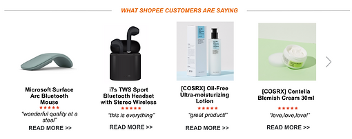
Proposed Shopee Customer Review section near footer of the page
4. Cover flow to improve visibility of main ads
The current slide show features many promotion 'slides' that are hidden until the time is up for the slides to change or the user manually clicked through the various slide. This may lead to poor visibility of some of the promotion.

Original Shopee Main Ads

With a cover flow, shoppers are given a glimpse of the other ads, which may entice them to click to view all the slides.
Proposed Shopee 'Centre Stage' ad slideshow
Others

-
Placement of customer help
To further facilitate customer who need assistance, the help centre icon and chat function be grouped together and pinned at the bottom right corner of the page.
-
Increase ease of navigation
Also, to create a more smooth browsing experience, a ‘TOP’ button can be pinned for shoppers to easily go back to the top of the page.

Proposed Shopee Website

-
Optimise website breakpoints
Using Gestalt theory of Continuity, I placed the breakpoint of the website to reveal the header ‘Top Products’ to entice users to continue scrolling down to see the featured products and more. This is because when we see a pattern, our eyes tend to follow its direction until it ends.
However, the breakpoints would differ based on size of the screens and might be hard to standardise.
Proposed Help Centre and navigational button pinned at bottom right of the page
My areas for improvement
-
User Research
This was intended to be a short exercise to train my design skills. However, a proper redesign would require user research and interviews to gather real feedback from shoppers before embarking on any changes.
-
Eye-tracking prediction software
It would be beneficial to adopt a software that creates a heat map of the website to optimise placement of promotion and improve conversions.

Proposed Shopee Website
(Total page length of 3 macbook screens)
Learning Points
From this exercise, I learnt to structure information quickly on an e-commerce site using visual perception principles and cognitive psychology. This was very helpful in putting what I learnt from my Interaction Design Foundation (IDF) classes and online articles into practice.
next
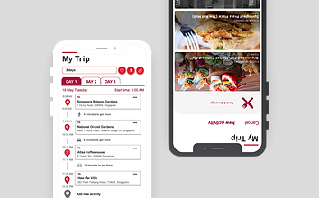
visit singapore
map your next adventure with ease
user research, product design